Heatmaps & polarity charts
Make scale batteries and image profiles readable: as a polarity chart, radar or heatmap — with competitors as subcolumns. And in tables, in-cell heatmaps highlight strengths and weaknesses automatically.
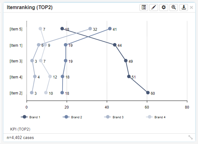
DataLion visualises scale batteries from Likert and matrix questions as polarity charts, radar or heatmaps — ideal for image profiles and brand comparisons where competitors sit side by side as subcolumns. In tables, in-cell heatmaps and conditional formatting make outliers jump out immediately.
- 🇩🇪 Made in Munich
- GDPR-compliant
- DPA included
- Hosted in Germany
Trusted by research, insights & media teams
- 50+ interactive chart types
- 20+ statistical methods
- SPSS · Excel · CSV import without data loss
- ISO 27001 certified data centers (Germany)
Polarity charts for image batteries
Likert and matrix questions turn into a clear line as a polarity chart: each scale gets its position between the poles, and you lay several objects — brands, products, audiences — over each other as lines.
That shows at a glance where your brand leads and where it falls behind. For multi-dimensional profiles, the radar chart is available too.
- Polarity chart for scale batteries
- Several brands or segments as lines
- Radar for multi-dimensional image profiles
- Labels and scale poles straight from the codebook
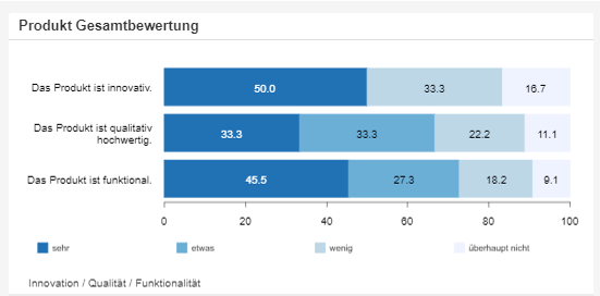
Heatmaps for dense matrices
When many values are compared at once, switch on the heatmap chart type: high and low values are colour-coded, so clusters and outliers in large matrices jump out immediately.
Ideal for image comparisons where many dimensions meet many brands — colour does the searching for you.
- Heatmap as a toggleable chart type
- Colour coding of high and low values
- Clusters and outliers at a glance
- Ideal for dense image and scale matrices
In-cell heatmaps & conditional formatting
The heatmap principle is in the crosstab as well: with in-cell heatmaps and conditional formatting you colour cells by their value. For brand comparisons, place competitors side by side as subcolumns — and see instantly where the gap is widest.
- In-cell heatmaps right in the table
- Conditional formatting by threshold
- Competitors as side-by-side subcolumns
See DataLion with your own data
Start a free trial or book a personal demo — from raw data to a finished dashboard.
What users say about DataLion
-
Very professional company, attentive to the customer needs, provider of a great software and service.
Generoso M. CRM Analyst · Automotive via G2 -
The contacts at DataLion are very committed. If you have problems, you can count on help. DataLion reacts quickly to requests for new functions.
Robert Q. Managing Director via G2 -
User-friendliness, especially for market research topics. Structured backend with many customization options.
Verified user Market Research via G2 -
The embedding function allows us to generate insights of our data for our audience and customers by far less than half of the usual time needed before.
Verified user Leisure, Travel & Tourism via G2

We now work much more efficiently, giving us more time to take care of the derivations and insights from the data for the customers.
More dashboard features
Common questions about heatmaps & polarity charts
What is a polarity chart good for?
Does DataLion have a heatmap chart type?
Can I colour table cells by their value?
How do I compare several brands in one profile?
Make your scales readable
Try DataLion free and show your image batteries as a polarity chart or heatmap — or get a demo.