Geo maps & word clouds
Bring regional data onto the map and open-ended answers into a word cloud: grasp distributions across regions and the most frequent mentions at a glance — instead of reading lists line by line.
DataLion shows regional data as a geo map and visualises open-ended answers as a word cloud or open-text chart. The word cloud reflects the frequency of the mentioned terms — the more often a term appears, the larger it is shown. So you grasp distributions across regions and topics at a glance.
- 🇩🇪 Made in Munich
- GDPR-compliant
- DPA included
- Hosted in Germany
Trusted by research, insights & media teams
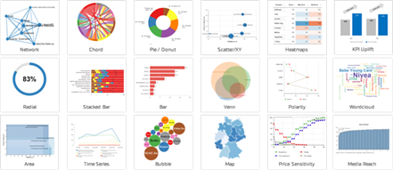
- 50+ interactive chart types
- 20+ statistical methods
- SPSS · Excel · CSV import without data loss
- ISO 27001 certified data centers (Germany)
Geo maps for regional results
When your data has a location, show it as a geo map or map: awareness by state, usage by region, store data by site. The map turns tables into a spatial pattern instantly.
Like every DataLion chart, the map is interactive and filterable — one click on a filter updates the entire view.
- Geo map and map chart
- Regional distributions at a glance
- Interactive and filterable
- Part of the 50+ chart types
Word clouds for open-ended answers
Open questions produce long lists. The word cloud condenses them into a picture: the more often a term is mentioned, the larger it appears. So you see the dominant themes without reading every answer one by one.
As an alternative, the open-text chart lists the same frequencies in a structured way.
- Word cloud by mention frequency
- Open-text chart as a structured alternative
- Most frequent terms instantly visible
- Filterable and segmentable like any chart
See frequencies — and have them coded
The word cloud reflects frequencies: it transparently shows which terms were mentioned how often. When you want to know whether the mentions are meant positively or negatively and which topic they belong to, the sentiment & topic analysis handles the AI-powered coding — writing sentiment and topic back as new variables.
So you combine both: the word cloud for the quick picture, the sentiment & topic analysis for analyzable coding — plus filters and segments to compare the most frequent mentions per audience.
See DataLion with your own data
Start a free trial or book a personal demo — from raw data to a finished dashboard.
What users say about DataLion
-
Very professional company, attentive to the customer needs, provider of a great software and service.
Generoso M. CRM Analyst · Automotive via G2 -
The contacts at DataLion are very committed. If you have problems, you can count on help. DataLion reacts quickly to requests for new functions.
Robert Q. Managing Director via G2 -
User-friendliness, especially for market research topics. Structured backend with many customization options.
Verified user Market Research via G2 -
The embedding function allows us to generate insights of our data for our audience and customers by far less than half of the usual time needed before.
Verified user Leisure, Travel & Tourism via G2

We now work much more efficiently, giving us more time to take care of the derivations and insights from the data for the customers.
More dashboard features
Guides in the help center
Common questions about geo maps & word clouds
Can I show regional data on a map?
How does the word cloud in DataLion work?
Does DataLion run AI text analytics on the open ends?
Can I filter the word cloud and the map?
Put your data on a map and a word cloud
Try DataLion free and visualise regional data and open ends — or get a demo.