5 steps to your first dashboard
1. Check the dataset (before you get started)
Data can be imported in csv, Excel, or sav (SPSS) format.
By the way: In DataLion, value labels can be stored separately from the dataset as meta information. When using sav files (recommended), the values and value labels are read directly and separately from the file.
Please check the following points in the dataset beforehand:
-
Recommended file format: UTF-8
-
Variable names contain no periods, spaces, special characters, and no leading digits;
-
Variable names are max. 64 characters long
-
There are no empty columns
-
Period as the decimal separator (can be converted during the data upload if needed)
-
To check your dataset for typical pitfalls, use our DataLion data validator: https://datalion.com/datacheck/
2. Registration
Register an instance (this is the DataLion website through which you will later access all your projects): https://app.datalion.net/register
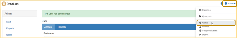
Navigating to the instance administration
-
Click on your name at the top right
-
Select “Administration” (or “Admin”)
This takes you to the administration of your instance. Here you can create projects and users, as well as perform updates
3. Project creation (backend) & navigation
Creating a new project
-
Click on “Projects” on the left-hand side
-
Click on “new” at the top right
-
Assign a project name (this will later be displayed in the URL), an internal title, and select a theme (basic layout for the project – can be changed at any time later).
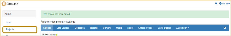
Save —> You will then be redirected to the backend of your project (blue navigation bar). -
If needed, you can change the project language at the bottom of the page
Navigation
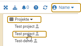
Navigating between projects
If at a later point you have several projects in your instance, click on “Projects” directly below your name to get to the start page (frontend) of the desired project.
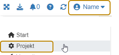
Navigating to the backend
If at a later point you want to navigate from the frontend back to the backend, click on your name at the top right and then on “Project” (with the gear icon).
4. Data upload & basic project settings (backend)
Data upload
-
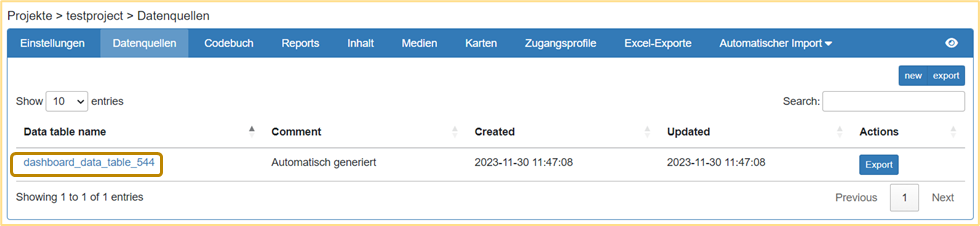
In the project backend, click on the “Data sources” tab in the blue navigation bar.
[Note: Data is imported into data sources. For most projects, one data source is sufficient; it then contains all the data] -
Click on the automatically generated data source to get to the data upload
-
Click on “Choose file” and select your dataset. Click on “Save” at the bottom of the page.
-
You will now see a preview of your data. All settings can be left at their default values (if your data uses commas as the decimal separator, please select the “Convert comma to dot” option). Click on “Save” again
-
After a successful upload, you will see a preview of your data at the bottom of the page.
Defining missing values
-
In the project backend, click on the “Settings” tab in the blue navigation bar
-
Click on “Missing values”. Define the values to be excluded from the calculations as missing values. Multiple missing values are entered separated by commas (e.g.: 99, 997, 998)
-
If necessary, also define NULL and empty strings as missing values
-
Define how missing values should be handled by default in the project (if needed, this setting can be overridden at the question level)
-
Click on “Save” at the bottom of the page
5. Create reports & dashboards (frontend)
A project is structured into reports and dashboards. A report contains one or more dashboards (tabs) on which your data can be visualized using different charts.
-
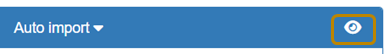
Switch to the frontend by clicking the eye on the right in the blue navigation bar.
-
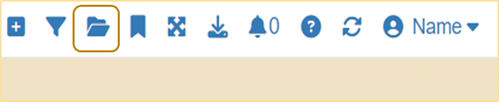
Create a new report by clicking the folder icon at the top right and then “New report”. Name it and click “OK”. You can later use the folder icon to navigate between your reports. You will now see your first dashboard “New tab”.
-
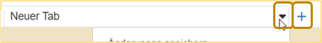
By clicking the arrow on the tab, you can rename, copy, label, save, or move your dashboard to another report.
-
Don’t forget to save your dashboard once you have made changes.
-
By clicking the ”+” next to the tab, you can add another dashboard (tab) to the report.
-
On the left-hand side you will find the navigation bar (if it is not visible, click the burger menu at the top left; 3 bars). Here you will find all the variables contained in your dataset by clicking on “Variables”.
[Note: You can permanently show or hide the navigation by clicking on your name at the top right and de-/activating it via “Show/hide navigation”]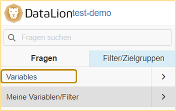
-
Creating charts: You can create a chart by clicking on a variable name or by dragging a question onto the dashboard via drag & drop.
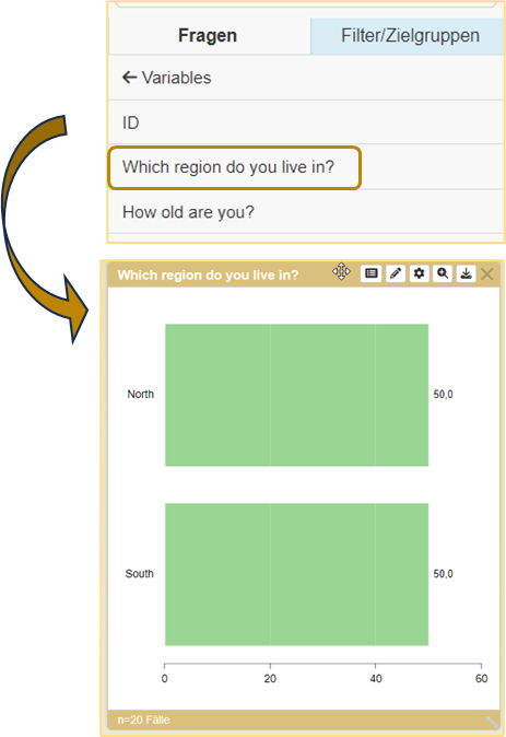
By default, bar charts are created. You can then customize all charts individually.
The most important chart settings can be found under the gear in the chart header:
-
Chart types: Here you can select how your data should be displayed. The most common chart types are:
-
For frequencies: Bar, Column, Pie, Donut, Line
-
For agreement scales: Stacked Bar, Stacked Column
-
For complex data: Table
-
-
Metrics: Here you can set the metric in which the data should be displayed. By default, percentages are shown. The most common alternatives are “Absolute values” and “Valid percent”.
-
Sorting: You can set this at the end of the list. By default, sorting is by the order of your variables. You can also sort ascending/descending or alphabetically.
-
New chart settings: Here you can make individual settings (e.g. colors, background color, showing/hiding various aspects).
-
Using the arrow at the bottom right edge of the chart, you can change its size.
-
By double-clicking the chart title, you can change it manually
-
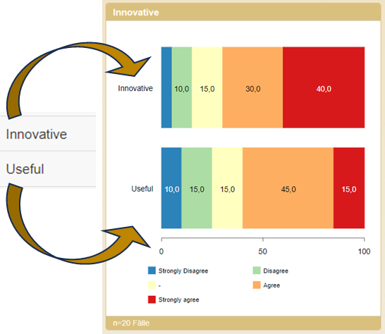
Merging questions: Often, different questions with the same categories should be displayed in a shared chart (usually with agreement scales). This works as follows
-
Drag the first chart onto the dashboard via drag & drop and switch it to “stacked bar”
-
Drag a second question with the same categories (!) onto the chart you have already created
-
Click “OK” in the pop-up (“Merged” setting)
-
The chart now shows both categories
-
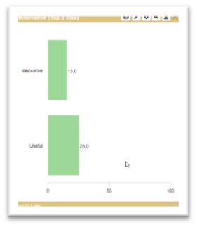
For stacked charts, TOPx boxes can also be formed under the settings (gear).
You can find information on handling multiple responses here.
-
-
Filtering or splitting data by particular characteristics:
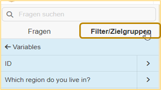
On the left in the navigation bar, switch to the “Filters/Target groups” tab (the background changes from gray to blue). Now you can use all variables as a split or filter.
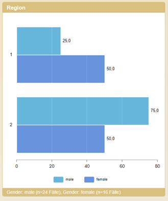
If you drag a variable onto an existing chart, the data is displayed split by the categories (available in most chart types)
If you click on a variable, the individual categories are displayed.
If you drag an individual category onto a chart, the data is filtered by this category. Adding further categories adds them as a split.
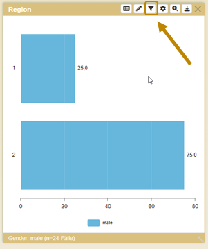
Filter settings can be changed via the newly available filter icon in the chart settings (order, delete, etc.)
Congratulations!
You can now get started with many combinations and display options for your project!
In the next article you will find helpful additions to use DataLion more efficiently and more comprehensively.